I Rebuilt a Tableau Dashboard in Power BI Without Writing a Single Line of Code Myself

I hold certifications in both Tableau and Power BI. Not because I picked a side, but because I’ve always needed to stay relevant. Early in my career I made a decision: I wasn’t going to be the person who got comfortable with one tool and hoped the industry didn’t move. I’m a Tableau Ambassador, a Microsoft Certified Trainer, and a Power BI user group leader who has built 100s of dashboards across healthcare, insurance, manufacturing, sports, waste management, nonprofits, and more. That range didn’t happen by accident. It happened because I have a family to provide for and a career to protect, and saying yes to new tools was how I did both.
That same instinct is what keeps pulling me toward migration projects. There’s no better stress test for what you actually know than being forced to translate it into something else entirely.
This one started with a question I’d been sitting on: could you rebuild a Tableau dashboard in Power BI without touching the GUI at all? Code-first, terminal-driven, AI-assisted where it made sense, and validated before Desktop ever opened. The answer is yes. Here’s what it took.
Before You Take This and Run With It
This is a public personal project built on public data. The Superstore dataset is a flat CSV that ships with Tableau as a learning resource. There’s no live connection, no incremental refresh, no row-level security, and no gateway configuration anywhere in this project. I have no idea how this workflow holds up against enterprise data, and I’m not going to pretend otherwise. If your org has complex security requirements, multi-source pipelines, or scheduled refresh dependencies, this post is a starting point for curiosity, not a blueprint for production.
The tooling is still maturing. PBIR and TMDL are evolving formats. Some features available in the Power BI Desktop GUI aren’t fully supported in the file format yet, and that gap will surprise you at the worst possible moment. The pbir-cli I used is a community tool, not an official Microsoft product. Use it accordingly.
AI accelerated the work, but it didn’t replace the expertise. It helped with scaffolding and boilerplate and saved real time on the repetitive parts of building out the model, but it didn’t catch the measure/column name collision and it didn’t know the Azure Maps filled layer was going to fail. The validator surfaced those issues, and I had to know what to do with the output. That’s the honest version of “AI-assisted”: faster, not autonomous, and only as useful as the practitioner interpreting what breaks and why.
Real migrations are messier than this. This was one clean dashboard, one well-understood dataset, and a scope I defined myself. Enterprise Tableau environments have dozens of workbooks, calculated fields that don’t translate cleanly into DAX, and business logic that lives in someone’s head and nowhere else. What I did here is a proof of concept. A real migration is a project.
Start by Reading the .twb Directly
Before writing a single line of TMDL, I opened the Tableau workbook in a text editor rather than Tableau Desktop.
One deliberate choice upfront: I kept the file as a .twb rather than a .twbx. A .twbx is a packaged workbook, essentially a ZIP archive with the workbook and data bundled together, which means you have to unzip it before you can read anything. A .twb is just the workbook XML on its own, with the data source kept separate. I wanted to get straight to reading the file without adding that extra step.
A .twb file is plain XML. No conversion needed. The dashboard structure, calculated fields, and data source definitions are all readable directly:
xml
<datasource name='Sample - Superstore' ... >
  <column caption='Profit Ratio' datatype='real' name='[Profit Ratio]' role='measure' ...>
    <calculation formula='SUM([Profit])/SUM([Sales])' />
  </column>
  <column caption='Count of Orders' datatype='integer' name='[Count of Orders]' role='measure' ...>
    <calculation formula='SIZE()' />
  </column>
</datasource>
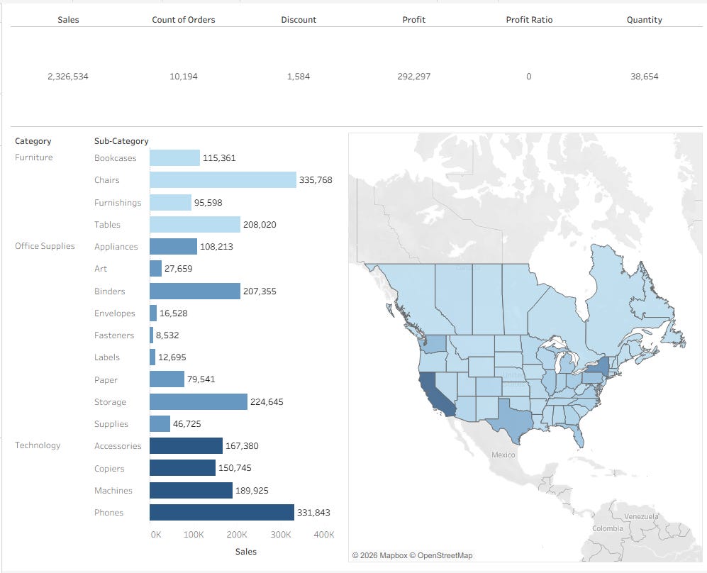
The dashboard had three sheets: a KPI strip (six big-number cards), a bar chart, and a map. There were also unused parameters and bins in the workbook that weren’t on the dashboard, so I deliberately skipped them. Start with what’s visible, not what’s buried in the XML.
You don’t need a migration tool to read a Tableau workbook. The source of truth is human-readable. You need to know what you’re looking at, and then you can translate it directly.
Building the Star Schema Directly in TMDL

The Superstore dataset is a flat CSV: 21 columns, about 10,000 rows, everything denormalized into one table. In a real client engagement, I would handle the star schema upstream, in a warehouse or a transformation layer, before the data ever touches Power BI. But this was a personal experiment, and I wanted to see how Power BI would solve it natively. So I designed the schema inside the model and hand-authored it in TMDL.
The pattern: one shared Power Query (Superstore Source) loads and types the CSV once. Every dimension table references that source and deduplicates to its own grain using Table.Distinct.
m
// DimGeography - dedupe to state/city level
let
    Source = #"Superstore Source",
    Selected = Table.SelectColumns(Source, {"Country", "State", "City", "Postal Code"}),
    Distinct = Table.Distinct(Selected),
    GeoKey = Table.AddColumn(Distinct, "GeoKey",
        each [Country] & "|" & [State] & "|" & [City] & "|" & [Postal Code],
        type text)
in
    GeoKey
The full schema came out to five dimension tables and one fact table:
TableRoleKeyFactSalesFactRow IDDimProductDimensionProduct IDDimCustomerDimensionCustomer IDDimGeographyDimensionGeoKey (surrogate)DimShipModeDimensionShip ModeDimDateDimensionDate (CALENDARAUTO())
The TMDL for a measure looks like this:
tmdl
table FactSales

  measure 'Sales' = SUM(FactSales[Sales Amount])
    formatString: "$#,##0"

  measure 'Profit Ratio' = DIVIDE(SUM(FactSales[Profit Amount]), SUM(FactSales[Sales Amount]))
    formatString: "0.0%"

  measure 'Count of Orders' = COUNTROWS(FactSales)
Notice Sales Amount and Profit Amount as column names, not Sales and Profit. That naming decision was forced on me by a bug I’ll explain in a moment.
Three housekeeping decisions worth noting: I set discourageImplicitMeasures on the model, turned off auto date/time intelligence (DimDate handles that explicitly), and tagged geography columns with data categories so Power BI knows State means a US state, not just a text column.
tmdl
column State
  dataType: string
  dataCategory: StateOrProvince
  sourceColumn: State
The Agent Stack
Before getting into what broke, it’s worth naming exactly what I was working with. The AI layer in this project ran through the power-bi-agentic-development plugin inside Claude Code, which is the same toolkit I covered in my Microsoft Build 2026 post. Three sub-plugins did the bulk of the work: semantic-models handled the data model using the semantic-model skill, pbip handled TMDL authoring and validation through the tmdl skill and the pbip-validator agent, and reports handled the report layer through the create-pbi-report skill. The pbir-cli (version 0.9.21) ran field validation from the terminal, and the Microsoft Learn MCP server (microsoft-learn) gave the agent access to current Power BI documentation when it needed to look something up rather than guess.
That last part matters more than it sounds. An agent that can reference live documentation makes different decisions than one working purely from training data, especially in a space like PBIP where the format is still evolving and the documentation is the source of truth.
The Bugs, and Why They’re the Most Useful Part of This Post
Code-first authoring earns its keep in the validation loop. Every problem below was surfaced by pbir validate –fields before Desktop ever opened, which meant I was fixing structural issues in a text editor instead of chasing visual glitches in the GUI.
Bug 1: Measure and Column Name Collision
Power BI forbids a column and a measure sharing a name in the same table. My first draft named measures Sales, Profit, Discount, and Quantity in FactSales, alongside source columns with those exact same names, and the validator immediately surfaced this as FIELD_KIND_MISMATCH. Desktop would have rejected the entire model without telling you why.
The fix was to rename the hidden source columns to Sales Amount, Profit Amount, Discount Amount, and Quantity Amount, while keeping their sourceColumn mapping pointed at the original CSV headers. The clean measure names still show on the cards; the raw columns stay hidden and out of the way.
tmdl
column 'Sales Amount'
  isHidden: true
  sourceColumn: Sales
  dataType: decimal
This is a classic modeling gotcha that rarely appears in tutorials because tutorials rarely use the same name for a calculated measure and its source column. In a real migration from Tableau, where measure names often mirror field names exactly, you will hit this.
Bug 2: Cards Bound to Columns Instead of Measures
When both a column and a measure share a name, the report binder defaults to the column. Because the name collision existed at bind time, each KPI card grabbed the hidden raw column instead of the measure and displayed a non-aggregating row-level value rather than a sum. The fix was to explicitly rebind each card as a measure reference using the Kind field in the PBIR JSON.
json
{
  "Entity": "FactSales",
  "Property": "Sales",
  "Kind": "Measure"
}
The Kind field is not optional when there’s ambiguity. Without it, the binder guesses, and it guesses wrong.
Bug 3: The CLI Was Editing the Wrong Report
pbir resolves report names against a registry, not the file system. I had another report registered from an earlier project also named Sample.Report, with pages called “Executive Summary” and “Campaign Detail,” and every command I ran was quietly editing that file instead of the one I was actively building. The fix is straightforward once you know it: drive every pbir command with an absolute path using --report /absolute/path/to/Sample.Report rather than --report "Sample.Report". It’s an easy habit to build and an expensive one to skip.
Bug 4: Page Folder and Name Mismatch After Rename
Renaming a page in PBIR requires updating three things consistently: the folder name, page.json, and pages.json. After renaming from the initial GUID-based name to “Overview,” the folder updated correctly but pages.json still referenced the old GUID. Desktop handles that mismatch silently and badly, which is exactly the kind of issue that costs you twenty minutes of confusion if the validator doesn’t catch it first.
Bug 5: Azure Maps Filled Layer Wouldn’t Geocode
The Azure Maps custom visual does not geocode reliably when authored from files. I configured the visual exactly as the JSON spec describes: location field bound, filled layer enabled, bubble layer disabled, Sales gradient applied. The visual rendered base tiles zoomed to the entire world with zero state shading, because the Azure Maps custom visual has initialization state that the Desktop GUI sets up interactively and that the JSON alone does not capture. There is no documented workaround for file-based authoring.
The fix was to swap to Power BI’s native Filled Map visual (filledMap), which geocoded US states immediately and rendered the choropleth correctly on the first load. One thing worth being precise about: the native Filled Map renders on Azure Maps base tiles under the hood, which is why you’ll see “Microsoft Azure / TomTom / OSM” attribution in the corner of the visual. That attribution does not mean you are using the Azure Maps custom visual. They are different things, and the distinction matters when you’re authoring from files: the native filledMap works reliably, the Azure Maps custom visual does not.
json
{
  "visualType": "filledMap",
  "query": {
    "projections": {
      "Category": [{ "queryRef": "DimGeography.State" }],
      "Y": [{ "queryRef": "FactSales.Sales" }]
    }
  }
}
The Agent Proposed Things I Never Asked For
I gave the agent the Tableau workbook, the CSV, and a screenshot of the original dashboard. The brief was to recreate what was there. The agent came back with more than what was there.
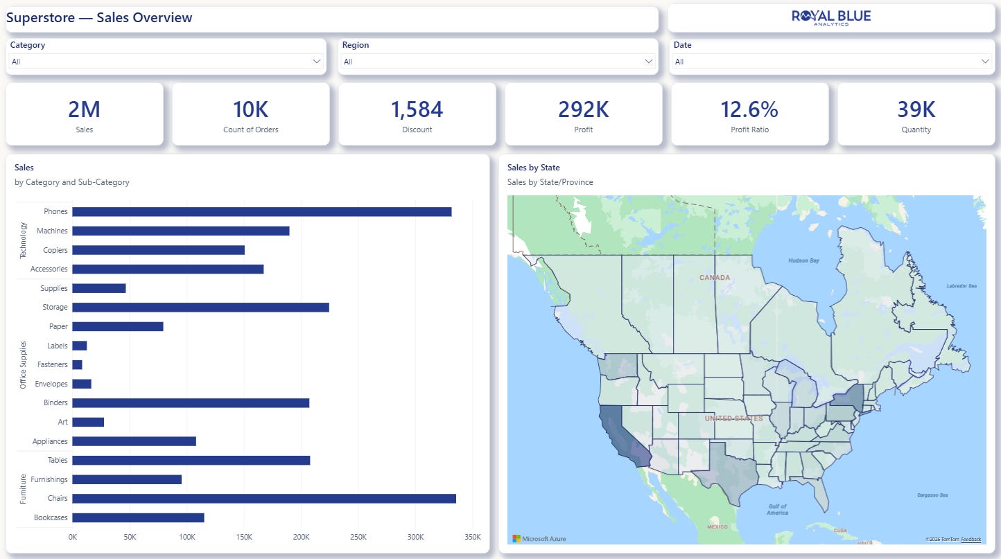
The original Tableau dashboard had no slicers. No filters, no way for an end user to cut the data without editing the workbook itself. The agent assessed the dashboard, determined that a sales overview without interactivity was incomplete, and proposed adding Category, Region, and Date slicers without being asked. I evaluated the recommendation as the practitioner and kept all three. It also made formatting decisions I hadn’t specified, including card layout, label sizing, and royal-blue theme application across visuals, some of which landed as-is and a few of which needed adjustment. Either way, the starting point was already closer to production-ready than I expected from a code-first authoring pass.
The agent proposed and I decided, and that distinction matters because “AI-assisted” gets used to mean everything from spell-check to full automation. This was neither. The agent was reading context, filling gaps with practitioner-level instincts, and surfacing recommendations for me to evaluate: a collaborator with good instincts and no domain authority. That distinction matters if you’re trying to explain this workflow to a stakeholder or a teammate.
The visuals themselves tell an honest migration story, and it’s worth saying upfront that they were intentionally kept basic. This wasn’t about building the most polished dashboard I could; it was about seeing how far the code-first workflow could take me before I had to intervene.
Tableau
Power BI
The Final State
pbir validate –fields passed clean: 12 visuals, 18 field bindings, all resolving. Desktop opened once for visual verification.
The KPI values matched Tableau exactly:

One callout on Profit Ratio: Tableau displayed “0” for this metric because the calculated field was formatted as an integer. The actual value is 12.6%. If a number looks wrong after a migration, check the format string before assuming the calculation is broken. That’s a formatting issue, not a logic issue, and they look identical until you dig into the field definition.
The bar chart, choropleth, theme, and slicers all rendered correctly on first open.
What Tableau Practitioners Need to Know Before Starting a Migration
Your .twb is already code. Read it directly, extract your calculated field logic, and translate it into DAX. You don’t need a migration tool. You need to know what you’re looking at.
TMDL and PBIR make Power BI diff-able and reviewable. A .pbix is a binary blob. A .pbip project is a folder of text files you can put in Git, review in a pull request, and track change by change. That’s how software engineering works, and it’s how BI development can work now too.
The validator loop is the workflow. Write TMDL. Run pbir validate. Fix what breaks. Repeat. Desktop opens at the end to verify, not to debug.
Measure and column name collisions will happen in real migrations. Tableau field names often match the names you’d naturally give a measure. In Power BI, that’s a model-breaking conflict. Rename the source column, keep the measure name clean, and use sourceColumn to map back to the original header.
When a custom visual won’t behave from files, try the native equivalent first. The Azure Maps experience is not unique. Custom visuals carry initialization state that the GUI sets up and files can’t replicate. The native alternative is often more reliable and faster to validate.
The whole project, from reading the .twb to a passing validator, ran entirely in the terminal, and Desktop opened exactly once to verify what the code had already built.
If you want the full TMDL model, the Power Query M, or the PBIR JSON for any section of this, drop a comment below. Happy to share the source.
Originally published on Substack.
Field notes on Power BI, Tableau, Fabric, Snowflake, and Databricks from someone shipping this work for real clients. Free, most weeks.